Why Your Smart Lighting Is Ruining Your Art (And How to Fix It)
Affiliate Disclosure: This article may contain affiliate links. Luxbrook earns a small commission on qualifying purchases at no additional cost to you. We only recommend products we have independently researched and believe offer genuine value.
The color temperature settings on most smart lighting systems are calibrated for comfort, not for how art actually looks on your walls. Here is what luxury designers specify instead.
You spent $12,000 on a painting and it looks flat under your smart lighting. This is not a coincidence.
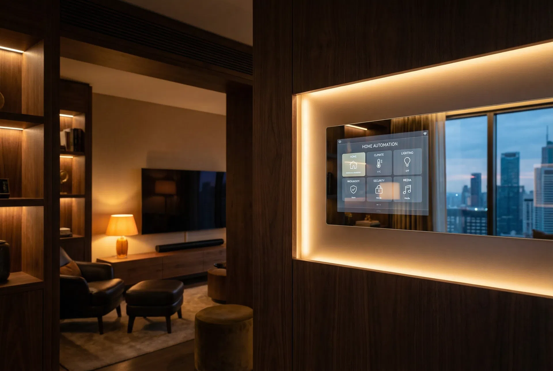
Most smart lighting systems — including Philips Hue, LIFX, and even Lutron's residential line — default to color temperatures between 2700K and 3000K for "warm white" evening modes. That range is optimized for human skin tones and cozy ambiance. It is not optimized for the chromatic accuracy that oil paintings, photography, and textile art require to show their full range.
The problem is compounded by CRI — Color Rendering Index. Consumer smart bulbs typically achieve CRI scores of 80–90. Museum-quality art lighting starts at CRI 95 and often uses specialized R9 values (deep red rendering) above 90. When your Hue bulbs score CRI 80 with low R9, reds in your artwork shift toward orange, blues flatten, and the depth that made you buy the piece disappears.
Why This Is Harder Than It Looks
The smart lighting industry has no incentive to solve this problem. Their customers are rating products on how comfortable a room feels, not on how accurately a Basquiat reproduction renders. The result is that every major smart lighting brand optimizes for the majority use case — general ambient light — and art rendering is an afterthought.
Lutron's professional Ketra system is the notable exception. Ketra uses a 22-channel LED engine that maintains color accuracy across the full dimming range, with a CRI of 98 and R9 values above 95. It is also $800 per fixture. For most homeowners, there is a middle path.
The Specific Solution
The fix is not to replace your entire smart lighting system. It is to add dedicated art lighting on a separate circuit with different specifications, and to adjust the color temperature and brightness of your ambient smart lighting when you want to view art seriously.
For dedicated art lighting, the standard is 3000K at CRI 95+ with an R9 value above 90. The Soraa Vivid line and Elco Lighting's museum series both meet this specification and are available as retrofit PAR30 and PAR38 bulbs that fit standard recessed cans.
> The single most important number in art lighting is not lumens or watts — it is the R9 value, which measures how accurately a light source renders deep red. Any R9 below 85 will make warm-toned paintings look muddy.
Practical Implementation
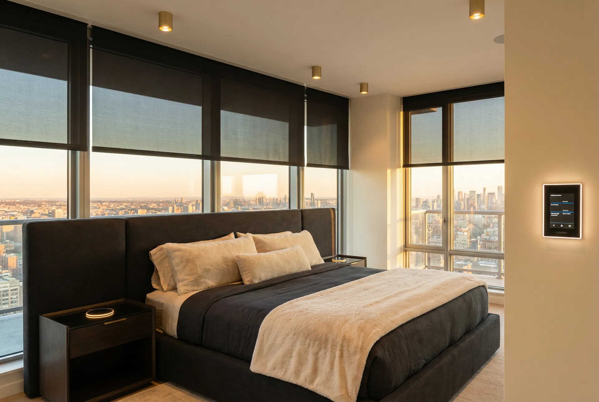
1. Identify which fixtures illuminate your primary art walls. These should be on a dedicated dimmer circuit, not part of your smart lighting group. 2. Replace bulbs in those fixtures with CRI 95+, R9 90+ options. The Soraa Vivid MR16 (ASIN: B00LDVMX2C) is the most accessible option at $28 per bulb. 3. Set your ambient smart lighting to 3500K or higher when viewing art — not the default warm 2700K. In Philips Hue, this is the "Energize" or "Concentrate" scene range. 4. Avoid mixing color-changing RGBW bulbs in the same room as art. The spectral gaps in RGB LED arrays create metamerism — colors that look correct under one light but shift under another. 5. If you use Lutron Caseta or RadioRA for your main lighting, add a separate Lutron Maestro dimmer on the art circuit so you can control art and ambient light independently.
Product Recommendations
For art-quality retrofit bulbs, the Soraa Vivid PAR30 delivers CRI 98 and R9 95 in a standard PAR30 form factor. It is not smart, but that is the point — your art lighting should be stable and accurate, not dynamic. Pair it with a standard Lutron Maestro dimmer for smooth, flicker-free dimming.
For rooms where you want smart control over art lighting, the Philips Hue White Ambiance line (not the full color version) achieves CRI 90 with better spectral consistency than the RGBW models. Set a fixed scene at 3000K and 80% brightness for art viewing.
FAQ
What color temperature is best for viewing art at home? Museum standard is 3000K at CRI 95 or higher. For home use, 3000–3200K with CRI 90+ is a practical target that balances art accuracy with ambient comfort.
Does Philips Hue ruin art? Not necessarily, but the default warm white scenes (2700K, CRI 80) are not optimized for art. Use the White Ambiance line at 3000K and avoid the full-color RGBW bulbs near artwork.
What is R9 and why does it matter for art lighting? R9 is the Color Rendering Index score specifically for deep red. Paintings with warm tones, flesh tones, and earth colors all depend on accurate red rendering. R9 below 80 makes these colors look muddy or orange-shifted.
Can I use smart lighting for a gallery wall? Yes, but use dedicated art-quality bulbs on the gallery wall circuit and keep the smart ambient lighting at 3000K or higher when viewing the art seriously.
Is Ketra worth the price for home art lighting? For a serious art collection in a primary residence, yes. For a few pieces in a living room, the Soraa Vivid line at $28–$45 per bulb achieves 95% of the result at 5% of the cost.
Shop the Article
As an Amazon Associate, Luxbrook earns from qualifying purchases.
Products Mentioned in This Article
Affiliate links · seperts-20
Climate Control
ecobee Smart Thermostat Premium
The most advanced smart thermostat with built-in Alexa and air quality monitor.
Smart Hubs
Amazon Echo Hub
8" smart home control panel with Alexa. Control all your devices from one screen.
Smart Speakers
Amazon Echo (4th Gen)
Premium sound with Alexa and smart home hub built in.
As an Amazon Associate, Luxbrook earns from qualifying purchases at no extra cost to you.
Related Articles


Rate This Article
Discussion
No comments yet — be the first to share your thoughts.